Published: November 22, 2022
You can brew the best milkshake IPA on the planet. But, if your beer label doesn’t catch the eye of the consumer and meet all the requirements mandated by the Alcohol and Tobacco Tax and Trade Bureau (TTB), your beer won’t stand out on the shelf. Or even make it to the shelf.
“Developing labels is getting brands in hands,” says Gavin Toth, co-owner of Divine Barrel Brewing in Charlotte, NC. Known for crafting a standout label, Divine Barrel’s Sunshine Felt Like Rain won first place in the 2021 Label Insanity Competition in the “Pale Ale” category and landed on Hop Culture’s “25 Best Beer Labels of 2021.” So Toth knows a thing or two about developing a successful can label.
The right can label can make all the difference on a crowded shelf. “It’s awesome to go to a party and get a beer in a solo cup, but I’d rather have my brand in their hands,” laughs Toth. “Literally something that says Divine Barrel and becomes recognizable.” In fact, Toth tells us that at any offsite events now, he asks if he can bring cans; they’re just that important. “Depending on the event, I can get fifty people hanging out by the bar, drinking our cans, and remembering a week later that it had the name Divine Barrel on it; it’s such a constant reminder.”
To say it simply: Your beer label will determine if someone buys your beer.
“You really can’t overstate how important your brand is,” says Tim Corcoran, co-founder of Massachusetts-based Coastal Mass Brewing, whose distinctive nautical-themed labels have set the tone for the brewery and consistently impress a loyal following. “Your can label designs are the first thing you should think of when it comes to a brewery’s branding, in addition to your logo.”
But building the perfect can label is an art in and of itself. There are so many considerations including the actual design, who designs the artwork, what type of label you use, the size of the label, how you print them, how you apply them, and how to work within the TTB requirements.
From the visual design to why you can’t use the abbreviation IPA to pressure-sensitive versus shrink sleeves, we’ll show you how to create the perfect beer label.
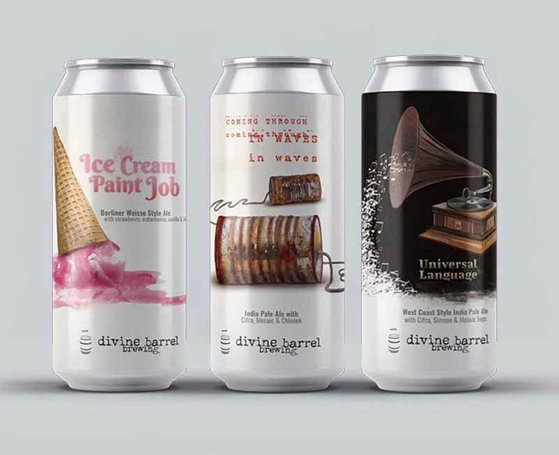
Above Image courtesy of Divine Barrel Brewing | Artwork by Dave Kaminsky
What We’ll Cover in This Piece:
Try Ollie Today
Affordable, Industry-Leading Brewery Software
Want to learn why breweries everywhere are ditching spreadsheets and switching to Ollie? Book some time with our team to learn more!
What Is the Very First Step to Creating a Successful Can Label?
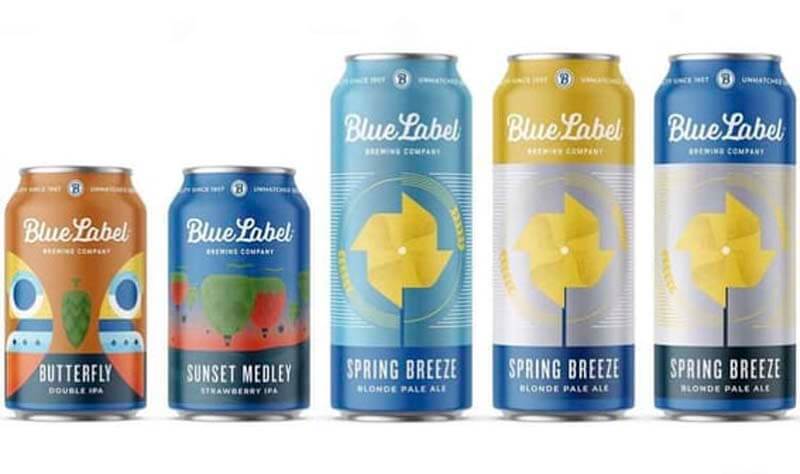
Source: Blue Label Packaging
Creating a successful can label starts with market research. Yup, it’s not sexy, but it will be the foundation for your brand.
Make sure you understand your brand. Ask yourself, “What is my product? What am I selling? Is it an ale? A lager? An IPA? Does the beer have some unique ingredient or hop? Is it American, German, English, or something else?”
“We think label design is the extension of someone’s brand identity, not just pretty pictures on a can, but a vibe you’re trying to communicate to customers,” says Matt Tanaka, founder of Stout Collective, a design-driven creative studio rooted in beer that designed over 500 beer labels last year alone. “The consumer makes decisions about your brand and what they want to drink in the moment. They don’t do it based on who you are—they do it based on who they are.”
With that in mind, you’ll want to narrow down exactly who you’re targeting. Who is your ideal customer? Even the funniest Game of Thrones meme won’t hit home with your parents if they’ve never even seen the show.
That said, you can’t satisfy everyone, so a label needs to focus on your core group. Is your beer for craft connoisseurs or local folks looking for just a drink or two after work? Millennials who post all over Instagram or mountain biking, hiking, and adventuring thirty-year-olds?
Lastly, consider how consumers are buying your beer. Are they picking up a six-pack as they shop for their family at the supermarket? Do they seek out a specific craft beer store like a BevMo! or Binny’s or even a small, independent craft beer shop? Are they purchasing online? Determining where your target consumer buys your beer the most can help establish your brand personality.
At Divine Barrel, Toth says their first cans landed at Whole Foods and Lowes Food, a local grocery store in North Carolina. Accordingly, he did an analysis of everyone else’s brands in those stores. ‘What worked, what didn’t, and why do we all still love Sierra Nevada Pale Ale?’ are questions Toth says he tried to answer. “We looked at other local brands that were doing well [and asked,] ‘Why do our cans look better or not? What works? How simple or how design-heavy does it have to be?’” says Toth.
He recommends taking a picture of the shelves where you’re going to sell your beer to just see what’s out there.
The analysis helped Divine Barrel come up with their design approach.
Return to top
Who Should Create Your Can Label?
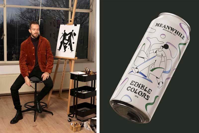
Photography courtesy of Meanwhile Brewing | Artwork by Timo Kuilder
The actual artwork of a can label is probably the most fun part of this process. But there are several considerations to understand.
First, who should actually create the artwork?
This pretty much boils down to three choices: Hire a freelance designer, use someone in-house (if you have them), or outsource to a third-party brand agency.
Each has their pros and cons. A bigger agency will handle all of the logistics and most likely understand all of the TTB requirements. But it’ll also be more costly.
Typically, designs for a single label cost anywhere from $100 to $1,000. So if budget is a consideration, think about hiring a local artist from your community whose work you appreciate or finding a freelance designer and establishing a relationship. Spend money on commissioning artwork instead of hiring a big design firm. The design may be a little bit simpler and you’ll still have to navigate the TBB legalese yourself, but you’ll still be able to create a unique brand identity for the right price.
But where you can’t compromise: It’s imperative that whoever you hire has experience designing labels specifically for craft beer or is willing to figure them out.
At Divine Barrel, Toth has worked with the same artist since the very beginning—Dave Kaminsky.
A designer who does work for a local news station, Kaminsky is used to working simply and quickly, meaning with Divine Barrel’s beer labels he can get creative but still turn work around fairly fast. And he’s super open to feedback, which according to Toth is paramount.
“Anybody starting to can beers should work with someone that is cool with feedback because ultimately it’s your brand,” says Toth.
Because they established a really solid relationship, in this case, working with just one person has several solid advantages.
“We get along well; he lives down the street, so I can call him any time night or day,” says Toth. “If you have that relationship, dig in. If you don’t, explore your options.”
Return to top
Understand the Fine Print, aka TTB and COLA Requirements
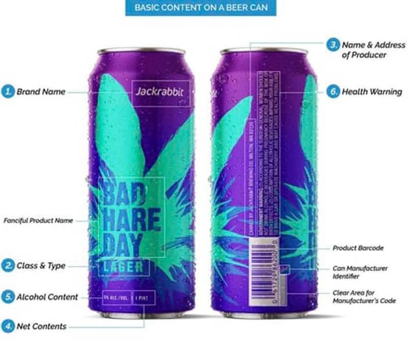
Source: Jackrabbit Design
We’ve covered all the TTB requirements pretty extensively here, so we recommend checking out this guide for a full rundown on all the requirements.
But suffice it to say that, while you explore the whimsical and wacky world of brand identity and label art with your designer, you’ll need to keep at least one foot on the ground because the government requires certain things of beer labels. If you’re putting cans of “malt beverage” (i.e. beer) into distribution, you need to follow the rules for label design set by the TTB, aka the Alcohol Tax and Tobacco Trade Bureau. Before you hit “print,” make sure the TTB signs off on your design by issuing a COLA, also known as a Certificate of Label Approval (COLA).
And if Toth had to give one piece of advice: “Call them up if you have an issue.”
He explains that if Divine Barrel had a label the TTB didn’t approve, he simply picked up the phone to “call and ask, ‘Hey, how did we mess up?” says Toth, noting that in some cases just by calling they’ve actually gotten the label approved.
Return to top
Top Seven Tips for Designing the Best Can Label
Image courtesy of Hop Culture
Now that you’ve figured out who is going to design your label and made sure to understand all the TTB requirements, you get to actually play around with the artwork.
There are so many different directions to go, so here are the best tips we’ve found from brewery owners like Toth and Corcoran.
1. Think About the Sweet Spot
In reality, consumers will only see a pretty small portion of the front of your can. You need to maximize that. For example, in the beginning Toth said when they first started putting beer in cans, their labels didn’t have Divine Barrel on them or the words would wrap all the way around the can or just be on the back. “We realized people had to twist the can to read the brand,” says Toth. “Or had to look at a much tinier font to see the style and even tinier font to see what’s in it! Oh, and by the way, who the hell makes this beer!? Our name wasn’t even on the front.” That wasn’t good enough because they weren’t maximizing Toth’s advice to get brands in hands.
A year in, Divine Barrel decided that they needed to get their brand name on the front of every can. “We finally added Divine Barrel and they sold a lot better,” laughs Toth.
2. Keep It Simple, Keep It Legible
Sometimes less is more. When Divine Barrel started a new lager series, they decided to stick with a very simplistic design—just a white can with the words of the style, i.e. “German Pils.” Toth said that was a very conscious decision. “A cool tidbit is that, at the time, the number-one selling SKU in all Whole Foods was the coconut water carton that just said coconut water,” says Toth. “I thought this was a real branding opportunity.”
But above all, you still need to make sure that people can read what’s on the label.
“Legibility is number one,” says Toth. “If I can’t read what’s on the label, I move on.”
The first words that people read on the label will be important. Let your consumer know what your beer is! If it’s an imperial stout, write that. If it’s an IPA (see notes below), indicate that. The most helpful step here is to build a huge word bank that you can whittle down to the most important names that your designer can use to create the art.
Seems like a lot? Well, the good news is that the beer industry isn’t held to the same standards as many others.
“There are many different ways to make a ‘good label,’” says Tanaka. “But one of the things we find fun about label design in the beer world is that a lot of rules for classic good design are completely broken. If you look at some successful beer labels and try to apply them to someone making soup or granola, it would never pass. But our world is fun and exciting to explore.”
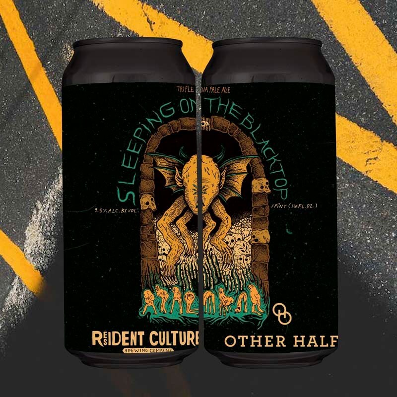
Image courtesy of Resident Culture Brewing Company | Artwork by Maryssa Pickett
3. Play With Pops of Color
A pop of color is often the first element that attracts attention. Color can be powerful enough to evoke memory, emotion, and even seasons—have you seen a pumpkin beer that doesn’t incorporate some hue of orange or red? We often associate warm reds, oranges, and yellows with the hefeweizens and marzens popular in the fall while bright pastel greens, light blues, and lilac purples go with maibocks and blonde ales of spring. Color is a shortcut for you to prep the consumer for the beer inside.
“I start with the artwork and the artists to come up with something with a great color scheme to pop off the label and catch your eye,” says Corcoran.
Color is a teaser, a way of setting consumer expectations.
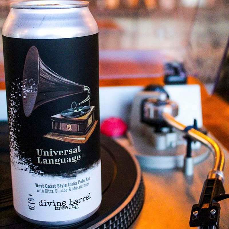
When Divine Barrel released its first year-rounder in cans—Universal Language—they set it apart by designing a dark top and white bottom.
“There is contrast on that one so it is eye catching with black and white,” says Toth. “We only have two year-round beers, so it catches your eye in different ways when on the shelf.”
More than that though, this label also incorporates personal elements unique to Divine Barrel’s brand.
Insider Tip: Be conscious of the colors you use and talk to your printer beforehand. “A lot of times in the beer space, a talented graphic designer will eye drop some random color they like, but that just increases your manufacturing costs by twenty-five percent,” says Boyd. “It’s just a good thing to have an understanding of how colors can affect pricing when producing labels.”
4. Get Personal
Toth says that one of the best ways to set your labels apart is to get personal with your designs, “because it helps push your brand, [and your brand] is a part of your life.”
For instance, on Divine Barrel’s Universal Language label, Toth explains there are music notes spilling out of the gramophone, bringing Divine Barrel up into the music and spewing music out into Divine Barrel. Which, as Toth puts it, “is what we do.”
Getting personal goes back to understanding your brand and finding a way to visually display that on the can.
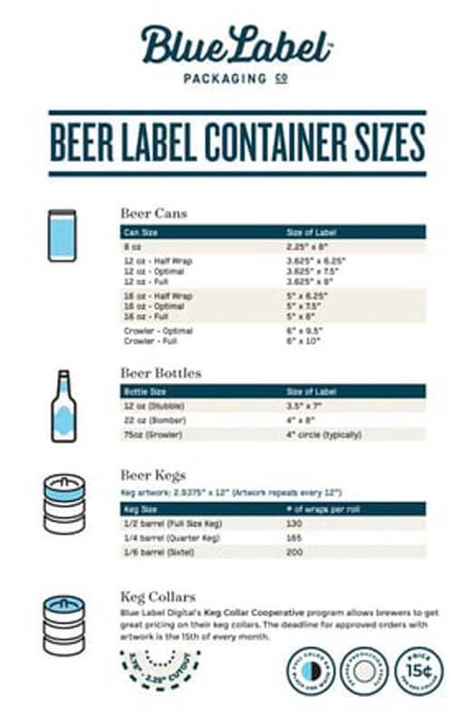
Source: Blue Label Packaging
5. Label Shape and Size
Do you want a traditional shape and size or something custom? Going the custom route might make your label standout, but it could also increase the printing costs.
For example, the popular Brooklyn-based brewery Other Half specifically uses labels designed for 12oz cans on 16oz cans. The smaller wrap gives their beers an iconic look that stays consistent across all of their beers.
Generally, label shapes fall into three categories:
- Partial wraps
- Full wraps
- Custom shapes
Partial Wraps
Partial wraps come with two separate labels, one for the front and another for the back. This is a common label type with bottles specifically, typically sized at 3.5” by 4”. The most important consideration here is to make sure that your printer can accommodate front and back labels on the same roll.
Full Wraps
Full wraps mean your label goes around the whole bottle. With these types of labels, you’ll have more room to design and add important details. But remember—with your bottle or can sitting on a crowded shelf, most likely the consumer will only see the first third of your label. You can have the most intricate design in the world that wraps around your whole can, but unless the front causes someone to pick it up, they’ll never see all that beauty on the back. Corcoran says that he had to learn this lesson the hard way. He actually recommends printing out your proof and wrapping it around your can because the 2D image on a computer screen can look very different in real-life 3D.
Similarly, Andrew Boyd, president of Blue Label Packaging, an all-digital packaging printer based in Lancaster, OH, always tells his clients to print out mockups first.
“I’m a big fan of testing things out before you commit,” he says. “There is no reason to gamble with something this huge. Always get a mock-up that’s color correct. Check the colors out in real life because things look very different on the screen than in the physical world.”
Custom Shapes
Finally, custom shapes can be a really fun, easy way to make your beer label stand out. Just make sure that it will actually fit on your bottle and can. One easy step here is to take a regular piece of paper and cut out the mock shape you’re going for. Wrap it around your bottle or can to get an idea of the space you have to work with while also checking for general fit. You can measure this final shape to share with your printer.
Whatever you decide, make a decision based on your overall brand identity. If you’re an edgy, contemporary brewery focusing solely on spontaneous fermentation, maybe you’ll want to go the route of a custom shape. But if you’re a traditional lagerhaus, a standard full wrap will probably serve just fine. Figure out your budget, stick to your brand, and go from there.
For reference, here’s a handy chart from Blue Label Packaging that lays out the most common label sizes.
6. Typography
Much like color communicates feelings and emotions, typography can indicate your brand style and personality. A classic serif font (one that contains little feet at the end of letters) says your brewery is more traditional, while a sans-serif typeface comes across as more modern. Similarly, different creative fonts evoke other things.
Insider tip: Remember that consumers and the TTB need to be able to read the words on your label!
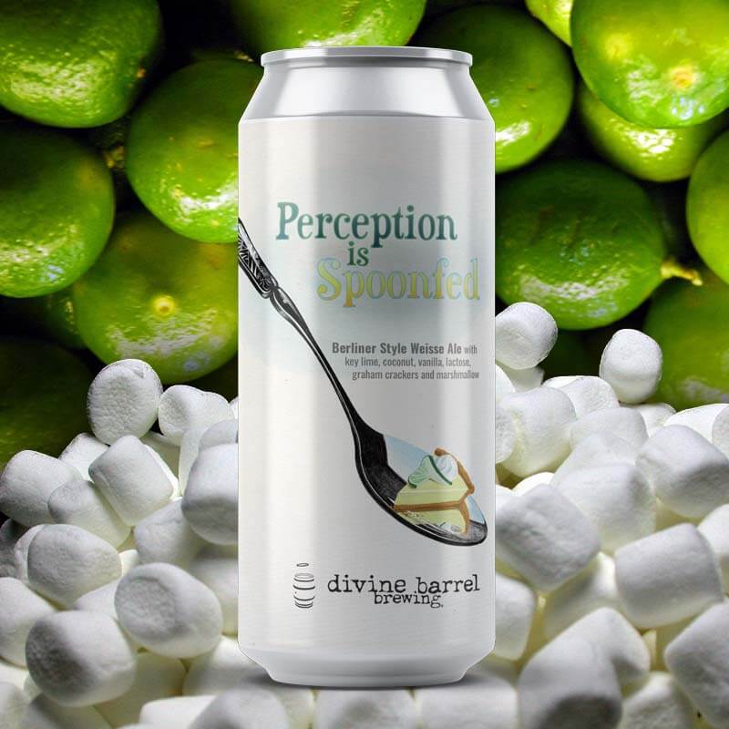
Image courtesy of Divine Barrel Brewing | Artwork by Dave Kaminsky
7. Style and Imagery
Nowadays, craft beer labels have become a form of art. Labels on beer cans cover the gamut from cartoon-style illustrations and comic panels to handcrafted masterpieces and work commissioned from local artists. At Channel Marker, Corcoran works with an artist in a studio next to the brewery to design custom oil paintings that are then turned into digital impressions and placed on their can labels. It’s a laborious process that often takes six to eight weeks, but the incredible art reflected on their unique can labels is paramount to the brand’s identity. Channel Marker also employs one of their front-of-house servers who is also a graphic designer.
“The number one thing for me is the artwork,” says Corcoran, whose labels almost always play into a nautical theme and feature vibrant colors. “We enjoy telling a story of some kind with our beer labels. When people come to buy cans, they always ask about the labels. It’s reassuring that people are noticing we’re putting in the time to make something cool and special, and it makes me want to keep putting in the time and effort even if it costs more time and money.”
Return to top
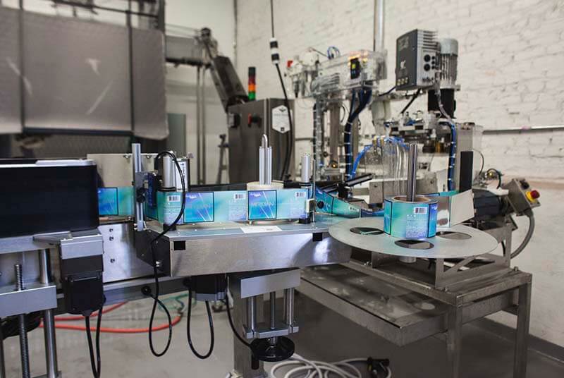
How Do You Pick the Right Printing Company?
Image courtesy of Blue Label Packaging
Now that you have a design, how are you going to print it? As you’ll see below, there are so many different decisions to make when it comes to printing your label, so finding the right printing partner is paramount.
Divine Barrel uses Encore Label & Packaging to print their labels. The fourth or fifth label company Toth has worked with, he says they finally landed on a winner for several reasons.
First, the company is local. “Luckily, we are right down the street, so they can hand deliver to us and they were able to optimize to help us out and give us a great price for a high-quality product,” says Toth.
In the past, Toth says he’s worked with label companies all across the country and if they had a problem with weather or something else, it could sometimes delay their labels by a week. “It’s worth it to pay a little more if [the company] is local,” says Toth. “[Plus,] we gave them feedback and they fixed the problem; it’s great to have a neighbor do the work with you.”
While you can generally order samples from any printing company, here’s where leveraging the expertise of a digital or traditional printer really comes in handy.
“A label provider understands what the beer industry needs specifically, knows the questions to ask, and the problems you can run into,” says Katie Harrington, marketing manager at Blue Label Packaging. “Are you applying by hand or using an applicator? Will the label come in contact with water? Is it going in a cooler or not? Is it sitting on a shelf? Is the decoration going to work? Can substituting something help achieve a look? There are so many possibilities that go into production to make your concept come to life.”
Return to top
The Two Main Ways to Apply a Can Label
Photography courtesy of Finback Brewery
Generally speaking, there are two main ways you can apply a label: machine application or by hand.
Machine Application
There are several different ways to apply a can label with a machine.
First, you could choose to go with a third-party company, like a co-packer, who will handle all the logistics for you, taking a lot of the operational decisions off of your plate.
But even here you have a choice: apply can labels at a contractors’ facility or have them come to you.
At Divine Barrel, Toth says they use Iron Heart Mobile Canning. The company brings a mobile canner out to their brewery production space and applies labels as a part of their canning line.
Alternatively, you could invest in your own machine and apply the labels in-house.
Lots of breweries don’t invest in label applicators from the start, but they can pay off in man hours down the road. For example, Corcoran at Channel Marker used to manually apply labels but invested in a Dispensa-Matic Label Dispenser last summer to help the brewery keep up with can volume.
By Hand
Or you could decide to apply your labels by hand. Hand-labeling is a time-consuming process but can be cheaper than other methods, especially when doing small runs.
Return to top
What Are the Two Different Types of Labels?
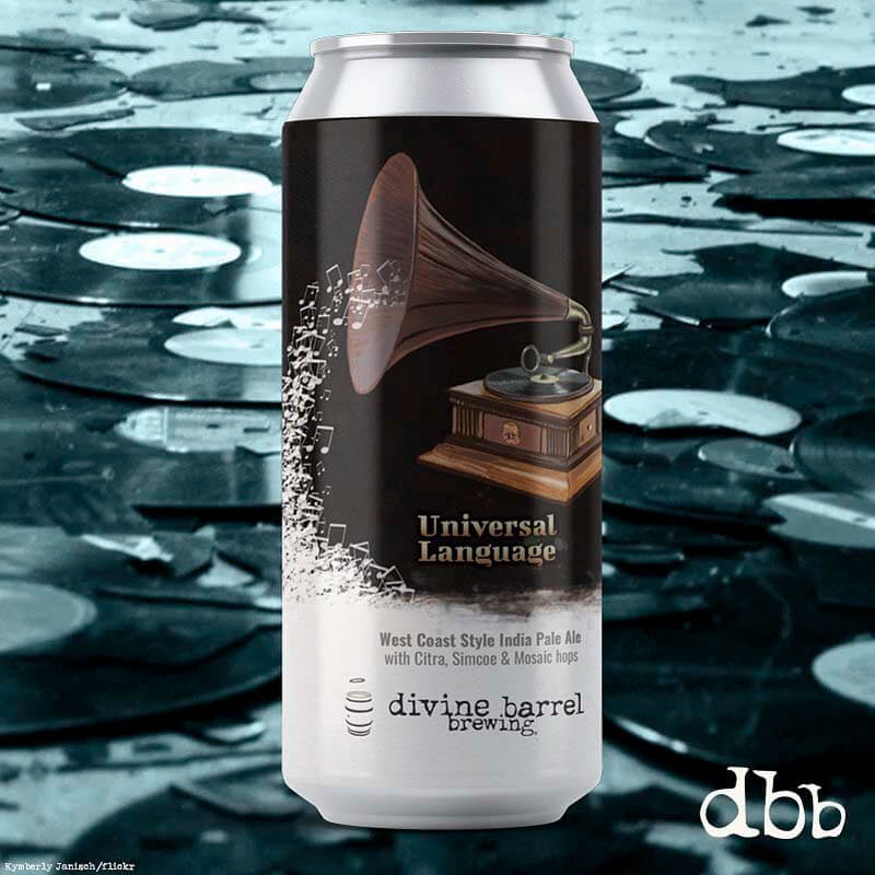
Image courtesy of Divine Barrel Brewing | Artwork by Dave Kaminsky
For the most part, there are two different types of labels you can choose.
Pressure-sensitive labels (PSL or PS labels)
Think of these labels like stickers. You use pressure to adhere the label to your bottle or can. You don’t need water, solvent, or heat to apply these labels, meaning they’re easier to apply and you have a lot more freedom to change material right up until the point of canning.
Shrink sleeve labels
Think of these labels like a skin or mask. These labels create a full 360-degree wrap around your cans. Heat is used to apply these labels so that they conform to the exact shape of your container.
With every square inch available, shrink sleeves give you plenty of space to visually represent your brand and fit in all the necessary information for the TTB. Also, these labels are a bit more durable, since they’re heat-bonded to the can and waterproof.
Boyd says shrink sleeves can be great for mid-sized beer runs or flagship beers. In fact, according to a 2018 AWA Market Report, shrink sleeves account for eighteen percent of the total label market.
But for breweries like Divine Barrel, which on average runs around 1,000-5,000 labels, the most sticker-like PSL labels make more sense.
“Yes, if we were bigger we would be doing shrink wrap, but for our size, our runs, this is what makes sense,” says Toth.
According to Boyd, the decision on which type of label to use comes down to figuring out what works best for your business. Shrink sleeves and pressure-sensitive labels are similar in cost, but with shrink sleeves you normally need to buy an entire palette of already-sleeved empty cans, meaning the lead times can be a little longer. And you need to buy more cans outright, whereas with pressure-sensitive labels you have a lot more flexibility to change things at the last minute.
Return to top
Choosing the Best Material for Your Can Label
Photography courtesy of Blue Label Packaging
The next choice you’ll need to make is the type of material to use for your can label. Generally, again, you have two choices here, but one really stands out from the other.
Paper
Paper labels give cans an embossed texture. These can have the look and feel of something slightly fancier. But the cons of this material is that it’s susceptible to water damage, and the canning process includes a lot of moisture.
“I don’t recommend paper backing because it gets wet and bad things can happen,” says Toth.
Boyd agrees. “We’ve seen lots of beautiful labels that look like crap on the store shelf because the rough canning process caused water to leak down and get under the liner. You can’t protect [these labels]. Because of this, somewhere around ninety percent of what we do is on film.”
Film
The more popular, more robust option, and the answer to almost all labels on cans is Bi-Axially Oriented Polypropylene (BOPP), which is essentially a laminated label that’s protected against the elements. “It’s cost effective and performance effective,” says Harrington.
And most importantly, BOPP labels hold up to moisture well. “From the filling process to all the refrigerating and moving around…BOPP holds up well to moisture, which is the most important thing for a beer application.”
And that can not be understated.
But just because you decide to use film doesn’t mean you can’t still get creative. BOPP film comes in metalized (silver), clear (translucent), and white varieties. “They all perform relatively the same, it’s just a matter of aesthetics and what your design is trying to accomplish,” says Boyd.
Although Harrington does point out that clear BOPPs are a little less forgiving, visibly showing bubbles beneath them if moisture gets trapped.
And if you want to go a level deeper and reach a bit farther into your own pockets, it’s worth mentioning specialty materials are available. For instance, Blue Label offers sparkly (what they call powder glitter in their bok) and holographic films. There are all sorts of varieties, but again these are definitely more expensive, so expect to shell out more cash if you go this route.
Harrington’s best advice here? “Use the material to your advantage.” For instance, if you have a ton of white in your artwork, use a white BOPP. But if you have a lot of metallic elements in the design, then think about using a metallic BOPP.
Return to top
How Are You Going to Print Your Label?
Photography courtesy of Blue Label Packaging
Options abound! Do you see a theme here? The decision tree when it comes to can labels continues to grow.
Flexographic
The most traditional way to print your can labels, Flexographic uses inks on plastic plates. It’s an attractive option because it has better pricing for long runs—around 75,000-100,000 labels and up. But there is a catch.
“Per unit it can be very cost effective, but you have to lock into the same SKU; the artwork can’t change,” says Boyd. “If you modify the artwork, it means you need a whole new set of plates” because it’s an older, more analog process.
But this traditional way actually produces some really stunning colors. In the industry the term used is gamut, basically the realm of all possible colors that exist. With Flexographic printing you can hit ninety-six percent of that gamut.
Liquid Toner and Inkjet
On the other hand, you could go with digital printing where you have two options.
Liquid toner gives you a higher-definition level of printing with a huge range of colors (ninety-five percent of the gamut), but can be more expensive.
Inkjet is sprayed on from above so it creates more of a sheen and only hits ninety percent of that gamut, but it can be a lot more cost-effective.
Return to top
Do You Want Any Final Flourishes or Finishes on Your Can Label?
Photography courtesy of Blue Label Packaging
As if the number of choices couldn’t get any bigger, you also have the option to add finishes and embellishments to your final label.
But this is an important decision, according to Boyd.
He says, “finish is important because it’s basically protecting the print from getting scratched up and falling off.”
There are two main ways to finish:
Varnish
Much like putting varnish on paint, this method adds a protective coat to the outside of the liquid.
Laminate
On the other hand, a laminate is a very thin film that goes over the top of your label, basically creating a sandwich of your printing.
Boyd says he sees a lot of breweries choose laminate because it’s cheaper and more durable. Plus you can customize the finish to be either gloss or soft touch. You’re probably familiar with the latter—it’s the velvet feel that’s become very popular on can labels. Again, you can customize even further here with different types of tactile finishes, but those will all cost more to produce.
Return to top
The One Can Label Tip That Could Save You Hundreds of Dollars
Photography courtesy of Divine Barrel Brewing | Artwork by Dave Kaminsky
Shrink the size of your label.
Toth says they actually print labels that are slightly smaller than the standard size, about three-fourths to half an inch smaller. Although not a cookie-cutter option, Toth says all he had to do was ask his printing company if that was possible.
He says, “That is an option to ask: If [you] do it slightly smaller, is it cheaper and will it save you hundreds of dollars?”
Return to top
Five Examples of Successful Beer Labels, and Why They Worked
“All of us would agree that the people that are expressing themselves to the fullest extent possible are the most successful brands,” says Boyd. “They had a vision of what the beer’s character and personality should look like. Those are the memorable packages.”
Art by Dave Kaminsky
1. Universal Language, Divine Barrel Brewing
The use of two distinct colors here is what sets this label apart. Introduced as year-round beer for Divine Barrel Universal Language was designed to stand apart on the shelf. “There is contrast, so it is eye-catching with just black and white,” says Toth. “We only have two year round beers so it catches your eye in different ways on the shelf.”
It’s also very personal to Toth who has a passion for music as well. “I do like that it has this cool flow where it connects the white and the dark part with music notes spilling out of the gramophone,” says Toth. “It’s bringing Divine Barrel up into the music and spewing music out into Divine Barrel which is what we do. Universal Language is pretty near and dear to Toth’s heart. He says, “I came up with the name because music is a universal language much like math. Everyone can enjoy it and understand it.”
Just like everyone can enjoy and understand this label.
Art by Andrew Houle
2. Turn of the Tides, Coastal Mass Brewing
We love a brewery that riffs on a theme. And from their brewery name to the names of their beers (Navigate the Channel, Propeller, Flagship, etc.), Coastal Mass Brewing plays with nautical tropes to reinforce a sense of place: smack dab on the coast of Massachusetts, just outside of Salem.
With Turn of the Tides, that theme gets a boost from the art of Andrew Houle. Looking almost out of place on a beer can, Houle’s gallery-worthy artworks with light and clouds to place the scene firmly off Massachusetts’ coast. Look at the can and you can almost feel the salt in your hair.
Art by Stout Collective / Printed by Blue Label Packaging
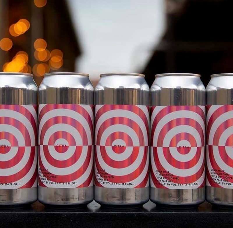
3. All Labels, Other Half
Other Half produces a very large number of labels but somehow manages to keep each one unique and yet consistent to its brand.
“When a new label comes out, we sit down with Sam Richardson, the brewmaster, and look at the name and recipe to develop how the feel would be best accomplished—whether it’s with an all-over pattern, cartoons, or a geometric pattern,” says Tanaka. “Regardless, all their concepts are defined, so the beer falls into one of them and even though there’s a huge variety there is still a level of consistency.”
Boyd continues, saying, “What’s crazy about Other Half is that there’s ninety-seven pages of beer on their website right now and twelve beers per page—that’s like, 1,000 beers. But the designs are so varied that no two are alike. Somehow they all portray the brand. Every week, we see another set of innovative labels coming from them that take these constraints and blow it out of the water.”
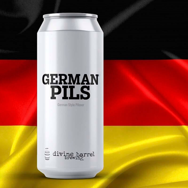
Image courtesy of Divine Barrel Brewing
4. German Pils, Divine Barrel Brewing
Sometimes just keeping it simple and to the point is the way to go. Toth said for this can label he actually looked around at what worked at Whole Foods, one of Divine Barrel’s main accounts. Fun tidbit: The coconut water carton that just said “coconut water” on it sold the best. “This is a real branding opportunity,” says Toth, who simply added the style/name of the beer and the Divine Barrel Brewing logo onto a white can. “If you look at any major old-school brand their name is on the front.”
Keep it simple and get those brands into hands.
Art by William Test / Printed by Blue Label Packaging
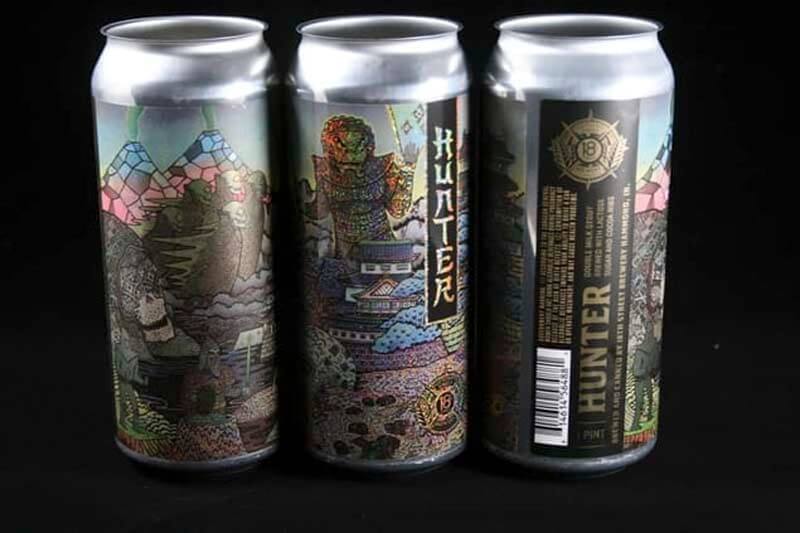
5. Hunter, 18th Street Brewing
This particular label won a second place 2020 HP Inkspiration Americas Award. It’s a great example of using the material to your advantage. Here, 18th Street leverages some of the specialty BOPPs. The can uses a metalized glitter material to really make it pop and has a crazy illustration with an immense amount of detail that’s enhanced by the glitter. It’s a label that perfectly speaks to 18th Street’s creative beverages!
Can Labeling Is Part of The Puzzle – Brewing Great Beer is The Other!
Ollie is brewery management software built by brewers, for brewers. From robust inventory management to automated reporting, Ollie is the ultimate tool to ensure your brewery business never misses a beat. Check out a free demo today and learn why breweries all over are making the hop to Ollie.
Return to top

About The Author
Grace Lee-Weitz
Grace is the Managing Editor for Hop Culture and Untappd. She also organizes and produces the largest weeklong women in craft beer festival in the country, Beers With(out) Beards and the first-ever festival celebrating the colorful, vibrant voices in the queer community in craft beer, Queer Beer.
An avid craft beer nerd Grace always found a way to work with beer. After graduating with a journalism degree from Northwestern University, she attended culinary school before working in restaurant management. She moonlighted as a brand ambassador at 3 Sheeps Brewing Co on the weekends before moving into the beer industry full-time as an account coordinator at 5 Rabbit Cerveceria.
Grace holds her Masters degree in the Food Studies program at NYU.
More From Grace